Two reasons I am impressed with this layout. First of all, it has 11 (ELEVEN!) photos on it! Second, I used my Silhouette to cut the title. It must be over a year since I last used it! :-o


 I am glad to know that she is super excited about it! She woke up this morning and went straight for it - VERY disappointed that we aren't starting this right away. Poor thing!!
 Some closeups:
 Everything is magnetic - including the little circles inside the tins. So if I get tired of the design or want to use it for another holiday, I can reuse the tin!
 Now I need to figure out where I will store the days as we remove them...And decide if I want to include a title. I could cut out some words in the green/red cardstock using my Silhouette and put them at the top and/or bottom....like "Merry Christmas" or "Happy Holidays" or "December". What do you think- Add words or leave it alone? If you vote for adding something - what do you suggest?
 I used sketch #31 at 52 Sketches...52 Weeks for my inspiration and it came together very quickly. The only problem with this layout was that it was 10 PM, both girls were sleeping and I wanted to finish the one last step of putting glitter on that arrow. I needed to use the SU! heat & stick powder...the heat gun is not too loud but I guess it was loud enough to wake both of the princesses ;)
 Thanks for looking!
 I copied the layout exactly like the front cover of our Pine Cone Press Design's idea book - but they used the Jolly By Golly line from Cosmo Cricket. I tried to find an image to show but didn't come across one easily - and am too lazy to just go take a picture of my book!
 What I really thought was neat was making my own "chipboard". I got the idea from someone on the Quickutz Yahoo group forum. I used the Silhouette to cut "family" 3 times and then glued them together. It gave the added dimension to the page without having to use popdots...would have been hard with this font to keep them hidden. Stacking them was actually very easy - I expected to have some issues getting them stacked so nicely.
 One more layout to share tomorrow (NOT orange!) then I'll have to get busy again!
 Credit for this next title goes again to my sister!
 There's no "bling" on this page...but I'm guessing once I see what others did at our bookclub meeting, that I'll come away with an idea to dress it up a little (pun intended!).
 What do you think...should I add some stickles to the SpongeBob in the corner? The page seems very bland but I'm not sure how to spice it up...it feels very "Old School" to me :)
 Or I could add stickles onto the logo....?
 I had so much fun with the logo. I copied it from the Nick website, was able to download a SpongeBob font for free and then I used my Silhouette to cut the letters out. I actually used the negative space for "SquarePants" then free handed the turquoise bubble shape. And I was especially excited to find rub-on flowers in my stash that matched the logo! So do I need to create the pores with another shade of yellow & a punch...or with stickles? Any suggestions you have to improve this are welcome.
 But seriously, isn't it awesome what I can do with the Silhouette????
 Ehh. It's not my favorite layout but I'm not sure why. I certainly strayed a lot from the sketch...that all started because I trimmed too much from the picture.
 I cut the flowers out using the Silhouette and they needed something. But I didn't have enough of any one embellishment to have it consistent. I wish now that I had just embellished a few and used the same embellishment. Oh well... I did discover that I really like teal and brown together, and I bet it will look even better with Kraft CS!
 I spent way too long deciding where to put the flower! lol
 P.S. Please pardon the construction here on the blog :) I hope to have it all finished in a day or two...
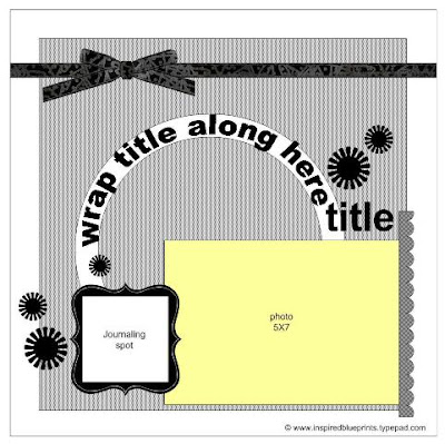 And here's my take on it-
 I'm going to need to get more of this Sultry line from Basic Grey...I love the colors!
 Enjoy your weekend!
 On this page, I added stickles to the waves and sun-

 And on this page, I took the journaling block out (I did mine in a line across both pages) and added the three flowers. I had to go shopping for ric-rac as the kit didn't come with enough. Then I added stickles to that and the flowers.
 The other kit used Pine Cone Press papers and man is it ever frustrating when they only give us one of each sheet of patterned paper. ESPECIALLY when it's double sided paper! The "What a Hoot" paper had my attention because I love owls but haven't used them much in my scrapping (although I've collected A LOT!). The theme was birthday so instead of doing 40th as in the book, I went back to my oldest daughter's first bday.
 Up until about 4 hours ago, I wasn't even going to show this LO - I was very bothered by all of the patterned papers but was committed since I already made so many cuts. I started off copying the LO in the book but changed it completely. I'm happier now because I covered one of the patterns with the brown cardstock.
 Stickles on the leaves and rhinestones for the eyes. One of the owls even has heart rhinestones :)
 Each of the pictures is actually a fold-out mini-album. They all have 3 pictures except for the one below on the right - it has 7 pictures tucked in there!
 I definitely think this layout is even cuter in person (aren't they all?). It took me several days of work (off and on of course) and I am TIRED of looking at it. I have a couple of sketches that I'm dying to try but I wouldn't allow myself to work on those until this was done! lol
  And then on the Studio Calico blog, Maggie Holmes posted a challenge about using a grid for a summer layout. I had just been to Kemah the night before and knew I could use a collage for those pictures. I printed the collage through Snapfish and was amazed at how easy it was! Both challenges used the square grids but I wanted a variety in sizes for this project so I went with the collage. I will certainly be using both the grid and collage for future projects - especially when I have tons of pictures.
 Too lazy to grab my other flash to get rid of that spot...
 Ignore the cat hair please :)
 Thanks for looking :)


 I completed K's 3 month layout. Going with the smaller album was supposed to help with me limiting the pictures to include on the page. Problem is, I'm getting tricky and sneaking extras in and it's taking me longer! Both sides have a lift-up flap to reveal another picture...


