Monday, August 31, 2009

Studio Calico & Pagemaps Contest

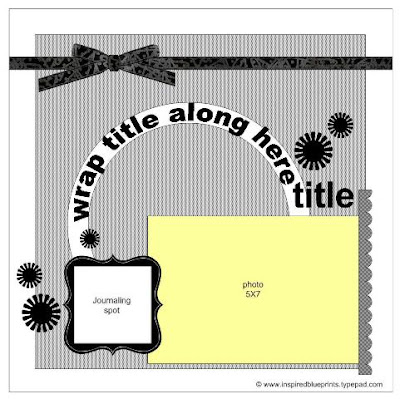
I saw this sketch contest on the Pagemaps blog and this is what I came up with: Ehh. It's not my favorite layout but I'm not sure why. I certainly strayed a lot from the sketch...that all started because I trimmed too much from the picture.
I cut the flowers out using the Silhouette and they needed something. But I didn't have enough of any one embellishment to have it consistent. I wish now that I had just embellished a few and used the same embellishment. Oh well... I did discover that I really like teal and brown together, and I bet it will look even better with Kraft CS!

I thought about not even posting this but wanted to prove that I am getting over my perfectionism! (That darn half-circle rub-on - I almost had it on there perfect!)
Friday, August 28, 2009

Public Service Announcement

For those that live in Texas, did you know that our booster/car seat laws are changing on September 1st? That's next week! The main change is regarding boosters - kids have to remain in a booster until they turn 8 or reach 4 ft 9 inches for their height. I'm thinking this is going to put one 7 year old in particular that I know back into a booster seat! Bestie H - isn't little H 7 years old? Info is here: http://www.txdps.state.tx.us/director_staff/public_information/pr060209.pdf

Tuesday, August 25, 2009

Cute Cuspids

Thanks to my non-scrappy but creative sister for supplying the title for this layout! Much better than "First Trip to the Dentist" ;)

I had a hard time getting started on this LO until I got over wanting the paper to coordinate with the dress colors. Then I was on My Mind's Eye blog and came across this layout - it all came together quickly after that. I had been planning on following another Pagemap sketch that was similar so mine is really a combination of the two. I was excited to find the free tooth font as well :)
I spent way too long deciding where to put the flower! lol
P.S. Please pardon the construction here on the blog :) I hope to have it all finished in a day or two...

Saturday, August 22, 2009

Inspired Blueprint Sketch #27 - Basic Grey Sultry

How did I ever scrap before without a sketch? I saw this one for Inspired Blueprints-And here's my take on it-I'm going to need to get more of this Sultry line from Basic Grey...I love the colors! Enjoy your weekend!

Thursday, August 20, 2009

My little Rock Star

I had the perfect two pictures for the 2nd sketch this month at Stuck? Sketches. I had actually picked out different paper and then went to Hobby Lobby to look for letters. {Since all stickers were 50% I stocked up on the letters....and I had NO IDEA that they carried Thickers and these puffy polka dot letters - they are my favorite right now!} While there, I happened to notice this sheet of paper - can you believe Hobby Lobby is carrying paper like this now?! Those stars and guitar, including the rhinestones around the stars, were already on the paper! I didn't follow the sketch exactly - mainly because the paper had so much embellishment on it that I didn't want to cover. And the title - those letters were just too big to run the title down the paper instead of across.
I added a few more rhinestones...
And I cut the starts for the center of the flowers using my Silhouette. MAN does that machine come in handy!
I need to go back to Hobby Lobby without kids so I can spend more time browsing - I'm really surprised with the inventory they are carrying now. And with those 50% sales....wow!

Wednesday, August 19, 2009

Bookclub Projects

Last month's projects for Pine Cone Press' Not Your Ordinary Bookclub were for the book "Celebrate the Good Times" (am I supposed to underline or italicize that?).

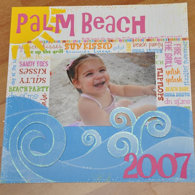
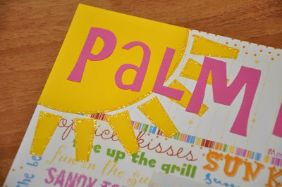
The first kit was a summer page using BoBunny paper. I stayed pretty close to the sample in the book but did change a few things and I think mine is veeeery cute! (might have something to do with the kid though!) On this page, I added stickles to the waves and sun-


And on this page, I took the journaling block out (I did mine in a line across both pages) and added the three flowers. I had to go shopping for ric-rac as the kit didn't come with enough. Then I added stickles to that and the flowers.
The other kit used Pine Cone Press papers and man is it ever frustrating when they only give us one of each sheet of patterned paper. ESPECIALLY when it's double sided paper! The "What a Hoot" paper had my attention because I love owls but haven't used them much in my scrapping (although I've collected A LOT!). The theme was birthday so instead of doing 40th as in the book, I went back to my oldest daughter's first bday.
Up until about 4 hours ago, I wasn't even going to show this LO - I was very bothered by all of the patterned papers but was committed since I already made so many cuts. I started off copying the LO in the book but changed it completely. I'm happier now because I covered one of the patterns with the brown cardstock. Stickles on the leaves and rhinestones for the eyes. One of the owls even has heart rhinestones :)
Each of the pictures is actually a fold-out mini-album. They all have 3 pictures except for the one below on the right - it has 7 pictures tucked in there!
And each of the sets has an owl as a tab to lift up.
I definitely think this layout is even cuter in person (aren't they all?). It took me several days of work (off and on of course) and I am TIRED of looking at it. I have a couple of sketches that I'm dying to try but I wouldn't allow myself to work on those until this was done! lol

It's 12:30 am....now I have to decide to start a new project or get some sleep....tough decision! :)

Sunday, August 9, 2009

Grids and Collages Everywhere!

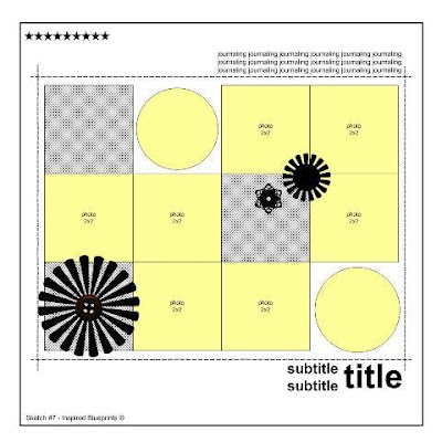
I seemed to lose my mojo this past week....not getting our books with the kits from the bookclub really threw me off! So I started looking for a sketch to inspire me and I found this one at Inspired Blueprints.
And then on the Studio Calico blog, Maggie Holmes posted a challenge about using a grid for a summer layout. I had just been to Kemah the night before and knew I could use a collage for those pictures. I printed the collage through Snapfish and was amazed at how easy it was! Both challenges used the square grids but I wanted a variety in sizes for this project so I went with the collage. I will certainly be using both the grid and collage for future projects - especially when I have tons of pictures.
Too lazy to grab my other flash to get rid of that spot...
Ignore the cat hair please :)
Thanks for looking :)

Sunday, August 2, 2009

Stuck?! Sketches

I came across a website today...where they provide sketches for layouts. After this successful attempt at following a sketch, I've been on the lookout for more.

Here's the link to the sketch and samples by their team members. I'm looking forward to more - it's such a great excuse to avoid all of my responsibilities around here!